
Ceraudo
AGENCY Diligent Commerce
ROLE Branding, Photography Art Direction and UI design
BRIEF E-commerce launch
HONORS & MENTIONS
Awwwards - Honorable mention
CSS Design - Special Kudos
STARTING POINT
Emily and Victoria Ceraudo, two sisters launching their new project, had a clear proposal. They wanted to cover an empty space in the market for young people: Why should we choose between Ikea or Habitat?
Why should we choose between mass production or exclusive products?
Ceraudo is a place for personality and bespoke services without compromising their prices. A space where vintage regains power over mass produced furniture.
NOTE
This project was conceptualized while working on the product and set photography’s art direction.
Some of the images used in some of the visuals do not belong to Ceraudo and were only used as Art Direction reference.
BRANDING
Ceraudo provides a combination of four services:
Curation, Sourcing, Design, and Collaborations with designers.
Their values embrace a quirky style of interiors and a sense of fun.
Ceraudo has the intention to normalize how our style changes over
time and help us find special and curated pieces for our homes.
I was inspired by the simplest drawing of a roof house we all do, and the
adaptability that a tipi tent has. While it provides warmth and comfort in
winter, is cold in the heat of summer, and is dry during heavy rains.
Also, one of the origins of a tipi is the place of reunion and community.
All of this embraces the Cosy/Home and easy to Change/Redesign principles
from Ceraudo.

COLOUR PALETTE
One of the main requests from the client since the start of the project
was to embrace colour. A warm vintage colour palette (related to their
vintage pieces curation) was then suggested to embrace each one of
the 4 main services the brand provides.

PATTERN COLLECTION
Used in stationery, packaging, wrapping paper, or even for digital
environments backgrounds, this pattern plays with Ceraudo’s idea
of fun when combining very different objects and furniture in a house.


PHOTOGRAPHY ART DIRECTION
Keep it real but playful was our mantra. Without forgetting the colourful soul
from Ceraudo, backgrounds were kept clean and clear to focus all attention
on the products. Materials like white marble, wood and brinks were used to
give a more relaxed and “less studio” background tone to the product shots.
Detailed areas and the texture of some products were important to be captured.
I also gave directions on how photography could influence interactions.

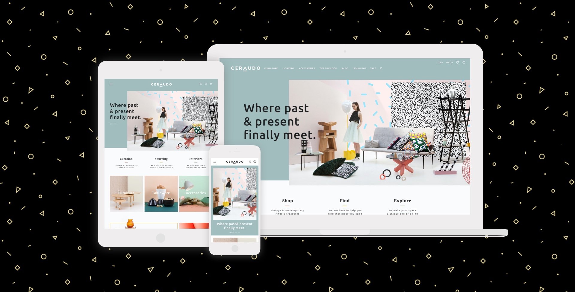
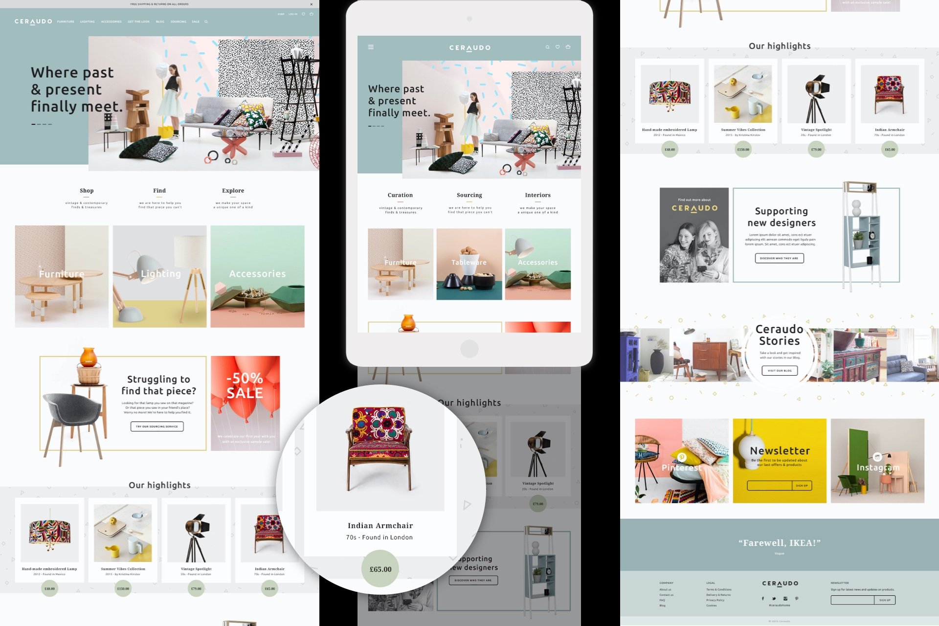
E-COMMERCE
Showcasing Ceraudo’s different services from the start of the page,
the homepage is a colourful journey with clear sections and information
about where every vintage curated product was found.


COMMERCIAL & TRANSACTIONAL EMAILS

ONLINE MAGAZINE BRANDING & BLOG


“Ceraudo's Cheerful New Furniture Line Is Seriously Smile-Inducing”
NEXT PROJECT